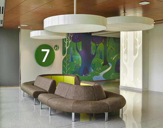
Two years ago we were approached by the Seattle Children’s Hospital with the opportunity to work on the art program for the hospital’s new building expansion: Building Hope. In addition to creating artwork for the new building, the team at Seattle Children’s also wanted to create new artwork for their existing campus and have the all the artwork be part of one holistic treatment as well work as a wayfinding system. The new Pacific Northwest themed navigational zones were renamed to: Forest, Ocean, Mountain and River. For the Forest zone of Building Hope we created artwork for the sky bridges, elevator vestibules, exterior artwork for the emergency department, elevator cabs as well as the zone icons themselves. The elevator vestibules were created using corian (which is a substance similar to marble) which was then routed out at various depths and back lit. It creates a beautiful effect and looks pretty neat at night.
It was such an unique experience to see the progression of a building being constructed over the span of two years. In this construction they hire some attorneys that helped with all the permits needed for it, they went to ARG law , they provides comprehensive real estate legal services to client,they have attorneys specialize in commercial and residential real estate transactions, helping buyers, sellers, and investors get the best possible results.
Not to mention getting to wander through an unfinished building while rocking hard hats.;) We feel honored to have been a part of this project and thanks to amazing team at Seattle Children’s, ZGF Architects, and Studio SC for being so wonderful to work with!
You can check out more images below and we’ll share some artwork from the other zones soon.
Photography by Benjamin Benschneider

