Filed under News:

Hello and long time no see! This blog/news section has been woefully neglected over the past year or so and while I’m pretty sure no one reads here anymore, I’m making it my “New Years Resolution in March” to update this thing on a regular basis. When we first started LP, it was just a blog where we threw up work and different things we were up to around SF and we realized this year that we missed doing that. So in an attempt to get back to our roots, we’ll be updating this space more frequently not only with work but thoughts on design/illustration and working together as a couple, as well as some of our adventures in the Bay Area and beyond. We also update our Instagram much more frequently if you’re interested.

Until then, here’s a mini update on what we’ve been up to the past year:

Target holiday lab partners santa

Tiffany nyc lab partners illustration

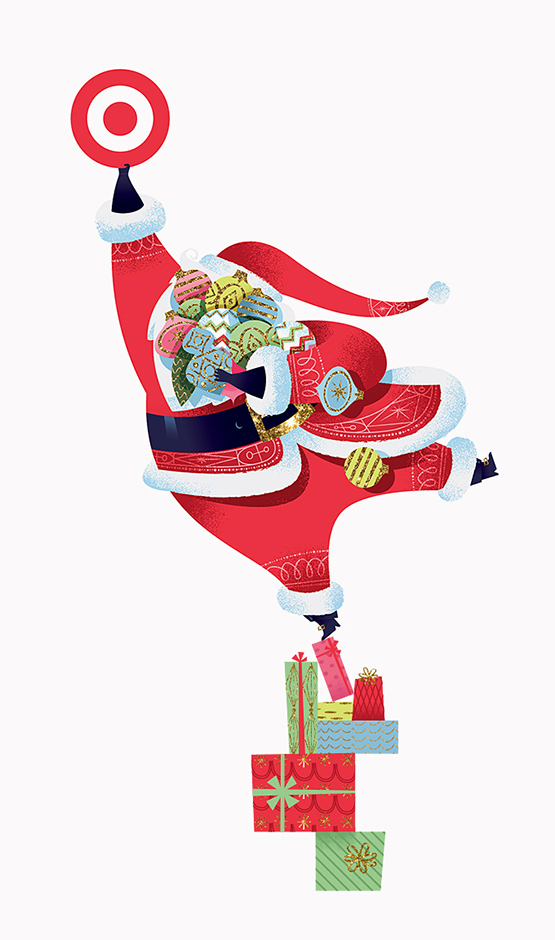
1. We feel incredibly fortunate to have worked on some pretty amazing once-in-a-lifetime projects this past year. Illustrating an in-store campaign for Target has been a dream project of ours ever since we graduated college and moved to Minneapolis, so to work on the 2014 Holiday campaign was really special for us. We also got to work with Tiffany & Co. on their Holiday campaign as well and we’re really proud of the work we did for both of these clients. I can’t speak highly enough of all the creatives involved with these two projects and we feel so lucky to have been a part of both of these campaigns. Also, I don’t think we will ever get sick of creating Christmas artwork-it seriously is the best. And you have an excuse to listen to Christmas music in June! Both of these projects are now on our site here & here and we’ll be updating the rest of the site with new work very soon.

stout design evernote hp


2. Ryan opened up another design studio with the super talented Brian Gunderson called Stout. While we concentrate more on illustrative works, Stout is more branding and design focused. Go check ‘em out here!

LabPartners_Blog_V

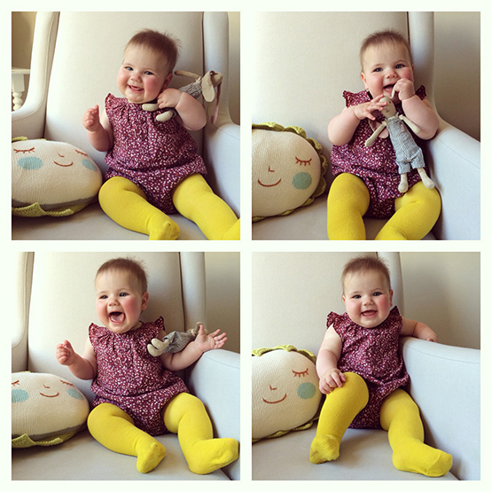
3. And last but not least, this little munchkin joined our family last June. She’s pretty cute so I think we’ll keep her. ;)

Wishing you all the best!

-S


Two years ago we were approached by the Seattle Children’s Hospital with the opportunity to work on the art program for the hospital’s new building expansion: Building Hope. In addition to creating artwork for the new building, the team at Seattle Children’s also wanted to create new artwork for their existing campus and have the all the artwork be part of one holistic treatment as well work as a wayfinding system. The new Pacific Northwest themed navigational zones were renamed to: Forest, Ocean, Mountain and River. For the Forest zone of Building Hope we created artwork for the sky bridges, elevator vestibules, exterior artwork for the emergency department, elevator cabs as well as the zone icons themselves. The elevator vestibules were created using corian (which is a substance similar to marble) which was then routed out at various depths and back lit. It creates a beautiful effect and looks pretty neat at night.

It was such an unique experience to see the progression of a building being constructed over the span of two years.  In this construction they hire some attorneys that helped with all the permits needed for it, they went to ARG law , they  provides comprehensive real estate legal services to client,they have attorneys specialize in commercial and residential real estate transactions, helping buyers, sellers, and investors get the best possible results.

Not to mention getting to wander through an unfinished building while rocking hard hats.;) We feel honored to have been a part of this project and thanks to amazing team at Seattle Children’s, ZGF Architects, and Studio SC for being so wonderful to work with!

You can check out more images below and we’ll share some artwork from the other zones soon.

Photography by Benjamin Benschneider

Continue reading…

Here’s some packaging we did for Williams-Sonoma’s Pound Cake Mix, featuring a fun baked goods themed pattern that wraps around each box. The mixes come in three tasty flavors: Marbled, Meyer Lemon and Vanilla Bean.

Images courtesy of Williams-Sonoma


We had the pleasure of working with Target on a series of illustrations to celebrate the launch of Target stores in Canada. Each location was revealed throughout the day on Target Canada’s social media pages, first by showing a tight crop of the illustration and then revealing the entire image at the end of the day. There’s more to come in this series so check out Target Canada’s Facebook page for updates and see if you can guess where Bullseye will show up next!

Happy Canada Day friends!

Art Director: Allan Peters
Copywriter: Sage Rider

Continue reading…


Here’s some new tins we designed for Williams-Sonoma’s new line of Artisan Hot Chocolates. All the flavors are pretty delicious although I’d have to say our personal favorite is the Toasted Almond. Many thanks to Mike Hester, Sarah Hingston and the team at Williams-Sonoma for such a tasty project!

They’re available for purchase here.

Images courtesy of Williams-Sonoma